
Carousel Editor
The carousel editor is used whenever imagery and other media are combined with titles, descriptions and navigation links. While it is called the Carousel editor, many other types of website components beside carousels may also use this editor. In general, it can be thought of more as a "slide" editor.
Editing Slides
The options within the editor will depend on the component being edited. In general, slides support the following features:
- Title
- Sub Title
- Description
- Navigation Link
- Media (ie Image, Video, External Video)
- Secondary Media (ie Overlay or Icon)
While these features exist across all slides stored in ArchiTECH, individual components will use whichever features are appropriate. This means that the editor will appear slightly different depending on which component you are editing.
To open the editor and begin modifying slide content, first open the page in edit mode, select the EDIT tab in the upper right, highlight the component containing the slides and finally select the editor tab in the upper left. The editor window will appear allowing you to modify content.
As mentioned above, depending on the component being edited, various parts of this editor will be available. The image above shows the main features you are likely to encounter while editing content.
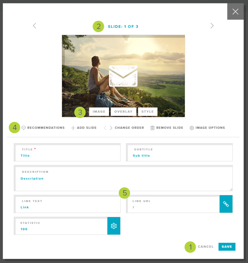
As with any editor, the SAVE and CANCEL 1 buttons are in the lower right corner. The close X in the upper right performs the same action as the CANCEL button. Once you are content with the changes you have made, click SAVE. If you do not want your changes to be saved, click CANCEL or X.
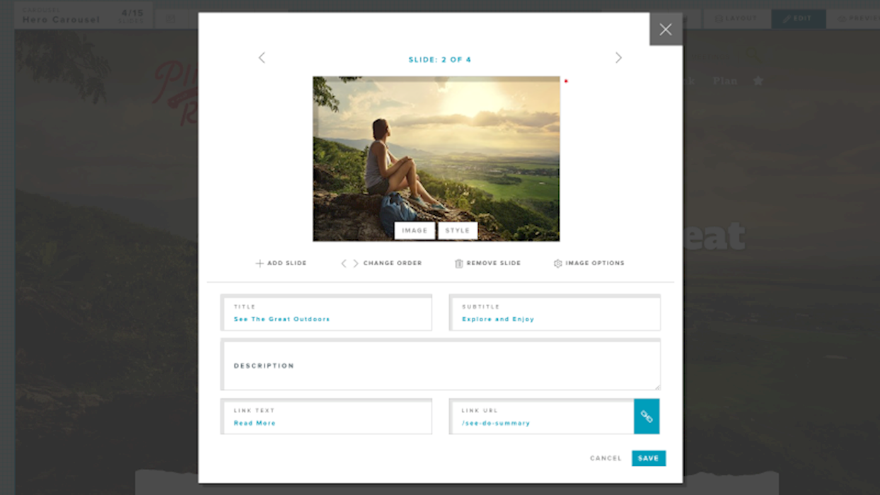
At the top of the window is a navigation bar 2 showing the slide you are currently on, the total number of slides and navigation < > arrows that allow you to switch to a different slide. On components with only a single entry where no additional slides are permitted, this bar will not appear.
Below the navigation bar is a preview of the image or media that will be used on this slide. Keep in mind this is NOT meant as a preview of how the imagery will look when rendered in the component it self. As part of the media preview, you will see configuration buttons 3 along the bottom. Depending on the style of slide (see below) different buttons will appear.
- Image Button - Allows you to select an image from the media gallery
- Video Button - For video style slides, this button allows you to choose a video from the media gallery
- Video URL Button - For external video style slides, this button allows you to set the external video URL
- Overlay Button - For slides that support a secondary image (ie Overlay or Icon) this button allows you to select this image from the media library
- Style Button - This button allows you to change the style of this slide (see below)
Below the media preview is the toolbar 4 showing additional controls. These include:
- Recommendations - For some components, this button offers usage recommendations
- Add Slide - For components that allow adding or removing slides, this button adds a new slide to the end. If this button is grayed out, the component has reached the maximum allowed number of slides.
- Change Order - These buttons allow you to move a slide to another position in the overall slide order.
- Remove Slide - For components that allow adding or removing slides, this button will remove the slide that is currently in view. If this button is grayed out, this component has reached the minimum allowed number of slides.
- Image Options - Allows you to change how an image is used in an image style slide
- Video Options - For video style slides, allows you to change how the video is used on the slide
Below the toolbar are one or more additional 5 fields that are generally displayed on, near or in relation to the media in the component. These include fields such as the title, sub title, description and web link and are often edit directly. Some components may also have a statistics or other customizations used by the component.
Slide Styles
The carousel editor often offers more than one style of slide. What options are available will depend on the component and your site design. Below is a summary of various types of slide styles.
Image slides are the most commonly used style and are the default style when adding new slides. Use the IMAGE button to select the image you want to be used. Use the Image Options to change how the image will be displayed.
Video slides allow the display of video content from your sites media gallery. Use the VIDEO button to select the video you want to use. Use the Video Options to configure how the video will be presented in the component.
External video slides act as a container to present a video hosted on an external service such as YouTube and Vimeo. Use the VIDEO URL to set the URL for the video to display.
Text slides have not media element and are generally used for components that mix slides with and without images.
LAST UPDATED: 6/7/2019